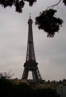
I think i'd previously written off the Eiffel tower as huge but odd-looking -however I think I have changed my mind now that I've had time to wander around underneath and really look at how the tower was constructed.
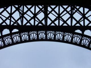
 There are actually some interesting decorative ironwork edges and the giant rivets and bolts that hold the tower together make it an almost lacy edged creation . In fact, it reminded me of some of the crocheted and starched doilies and table runners that used to be common in Scotland , when I was a kid.
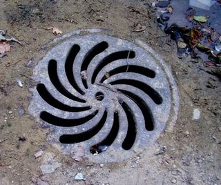
Even the drains looked lacy.
 I was surprised to see a grey heron in the pond at the foot of the tower. I think the bird was trying to catch an easy meal as the pond was full of large carp - but I didn't see it actually manage to catch any of the fish while I was there.
I think the heron was a random visitor, since the flock of ducks acted very oddly . When the heron flew off, all of the ducks turned to face the direction the heron flew in and started quacking and pointing into the sky with their beaks - like a bird version of Invasion of the Body Snatchers.
 My motive for visiting Paris was the "Love at First Sight, Love to Draw" SCBWI Illustrators workshop with Tomie dePaola and Martha Rago.
Martha Rago is the Associate Creative Director at HarperCollins Children’s books and she gave a lecture about what sort of things grab her attention when she gets unsolicited submissions. She used some actual examples of submitted book dummies and showed the progress from the dummy and early character sketches to the finished book.
She also said that she really loved getting promo postcards from illustrators. Apparently she pins them to her notice boards and keeps the ones she particularly liked in boxes, which she searches through when looking for an illustrator for a new project.
She also likes to get repeat postcards and feels that getting a succcession of postcards [particularly ones that have some sort of ongoing theme-even if it is just a seasonal theme] helps the artist attract the art directors attention and shows consistency.
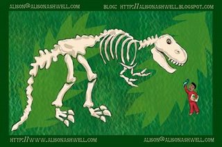
There was a promo postcard competition as part of the workshop - my entry is below.
 In Tomie dePaola's workshop in the afternoon, we learned a lot about Tomie's career and workstyle- and laughed a lot about the ubiquitous bunny rabbits in the children's book world.
Later, we worked on breaking down two strange sentences into a sequence of three illustrations in a short time [about 20 minutes]
The sentences were "Carrot and Blankey were friends. They had fun together."
It was a really useful excercise, I thought. It was difficult trying to work on something that would work without actually making Carrot a carrot.
I managed to come up with two different ideas for the sentences - Carrot as a rabbit with a favourite comfort blanket was the first
Quite a few other people made Carrot a rabbit - it seemed a good rabbit name to me.
 After the 'ordinary' version, I wondered about having the characters as aliens. They appealed to me more than the first version.
 I was surprised how many other illustrators made large sized images rather than thumbnail sketches or images slightly bigger than thumbnails- these were half thumb sized.
Thumbnail sketches can really help with brainstorming ideas. They can also be really good for playing with composition and even better they are quick and easy and can be scrapped without investing too much time and energy in the idea.
The workshop day seemed to pass by in a blur -I think a few of us would have liked a 2 day event rather than a single day - I suppose i need to start saving for the next SCBWI workshop.
Technorati Tags:
paris
eiffel tower
heron
photos
illustration
scbwi


5 comments:
I love the photograph of the drain, lovely colours and textures. I used to enjoy b+w photography when I was at college, especially this style, images that could just be patterns. The drain and the iron work might be a good starting point for jewellery designs, I will show Toby.
I agree about the thumbnail sketches, I usually start like that in my illustration work. I make the thumbnail drawings in a proportionate size to the required artwork, so if I use the idea I can just blow it up in the photocopier, or however, ready to work up to a more finished drawing. It really saves time. Before I did this I would often have some lovely little thumbnail idea, that just didnt work well in the commissioned size/shape, which was such a pain, I would have to rework it all.
Really interesting to read about your trip and the workshop.
Penny.
That worked, your 'boo' made me jump! Penny.
Love the frilly bits on the edge of the tower and that lovely drain cover. I wonder how many people ever notice them , concentrating on the so called 'bigger picture'.
Hey Penny, I think one of those buttons I sent you was the same sort of pattern as the drain cover. :-)
Hi Sue, I think it was! glad you mentioned it, I had forgoten to show Toby these photo's, will do now and look at it along with your button.
P.
Hi Sue,
Yes there was a button that you gave me a bit like the drain in Alison's photo.
Hi Alison,
Just got home from school, the photos are lovely, GREAT news about the earrings, thanks.
From toby.
Post a Comment